Maps Show What Major World Cities Would Look Like If Global Sea Level Rises
Global climate change has already had observable effects on the environment. Glaciers have shrunk, ice on rivers and lakes is breaking up earlier, plant and animal ranges have shifted and trees are flowering sooner.
Effects that scientists had predicted in the past would result from global climate change are now occurring: loss of sea ice, accelerated sea level rise and longer, more intense heat waves. The Intergovernmental Panel on Climate Change (IPCC), which includes more than 1,300 scientists from the United States and other countries, forecasts a temperature rise of 2.5 to 10 degrees Fahrenheit over the next century.
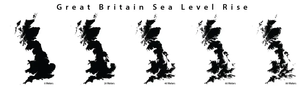
The US Geological Survey estimates that if all the world’s glaciers melted, sea level would rise by about 80 meters, or more than 260 feet. This scenario could be thousands of years in the future, but it would render many of the world’s best-loved coastal cities unrecognizable.
Jeffrey Linn, a Seattle man with a background in geography and urban planning, has created a series of maps of major US cities based on this doomsday scenario. He used actual geographic data from the areas to make the maps as realistic as possible.
Linn is working with the folks at the University of Leeds on a graphic novel depicting life in England in 200 years–if nothing is done to curb carbon emissions. It’s a sequel to their graphic novel about a low carbon future. The maps will be centered around York and Leeds, and includes the surrounding counties.
Linn says his interest in the subject was sparked by the book “Always Coming Home,” by Ursula Le Guin.
“The novel is sort of a future anthropology of California’s Napa Valley, and in it she looks into the future and sees the California Central Valley flooded by sea-level rise,” Linn says. “Since then, I would often think about what would the world around us would look like once all the ice caps melted.”
Check out the maps below:
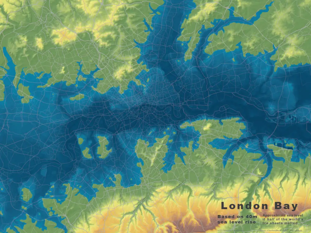
Base maps for London, at 40m of sea level rise.
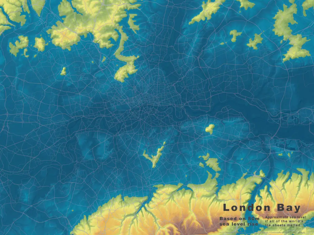
Base maps for London, at 80m of sea level rise.
England in 200 years–with an anticipated sea level rise of 8 meters.
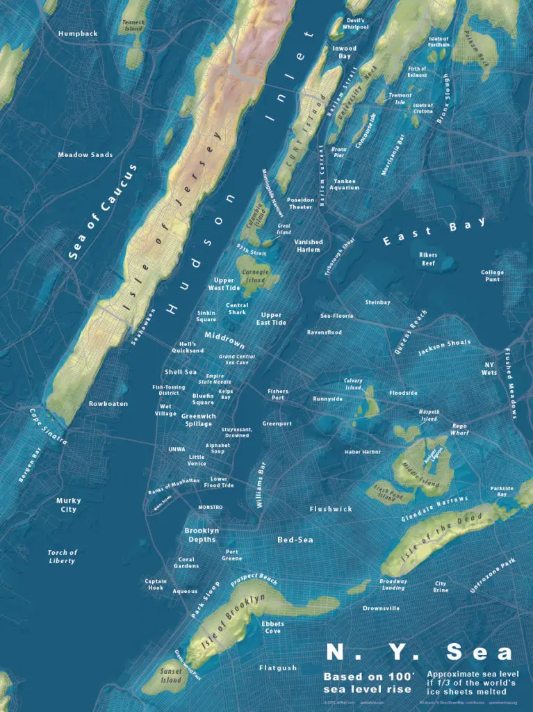
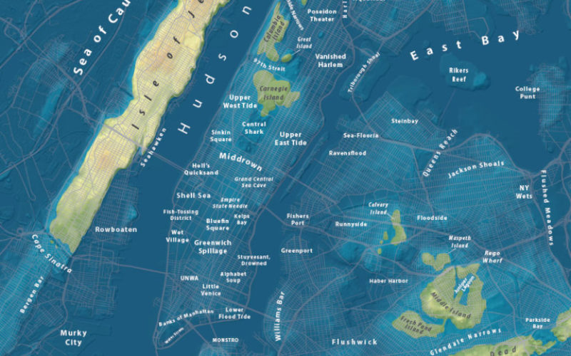
This NYC map shows the effects of 100 feet of sea level rise. According to the USGS, the highest it could rise is about 260 feet.
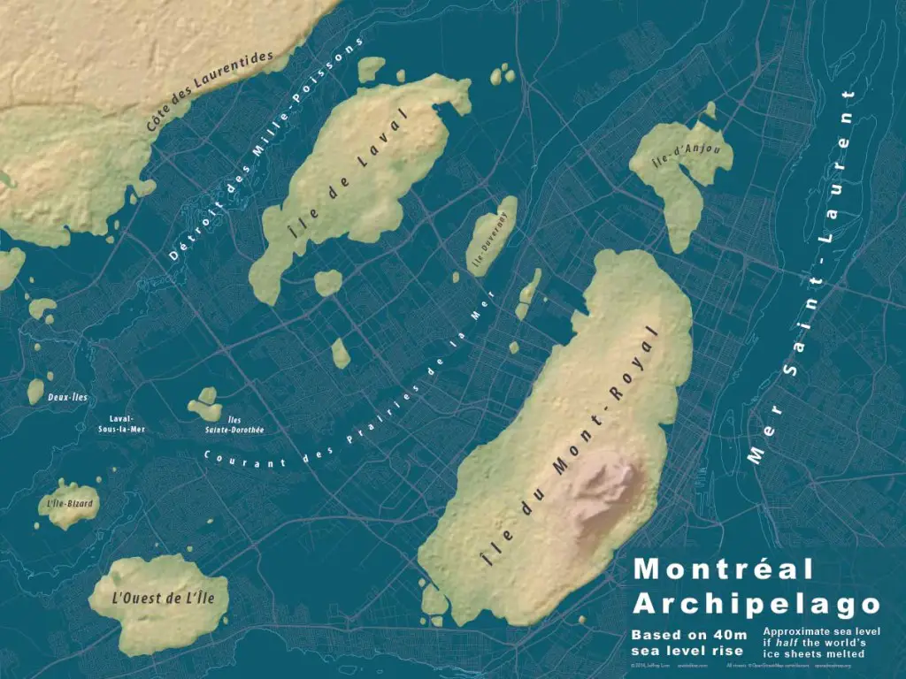
This map shows 40 meters of sea level rise. Only half of the world’s ice sheets melted to produce this archipelago.
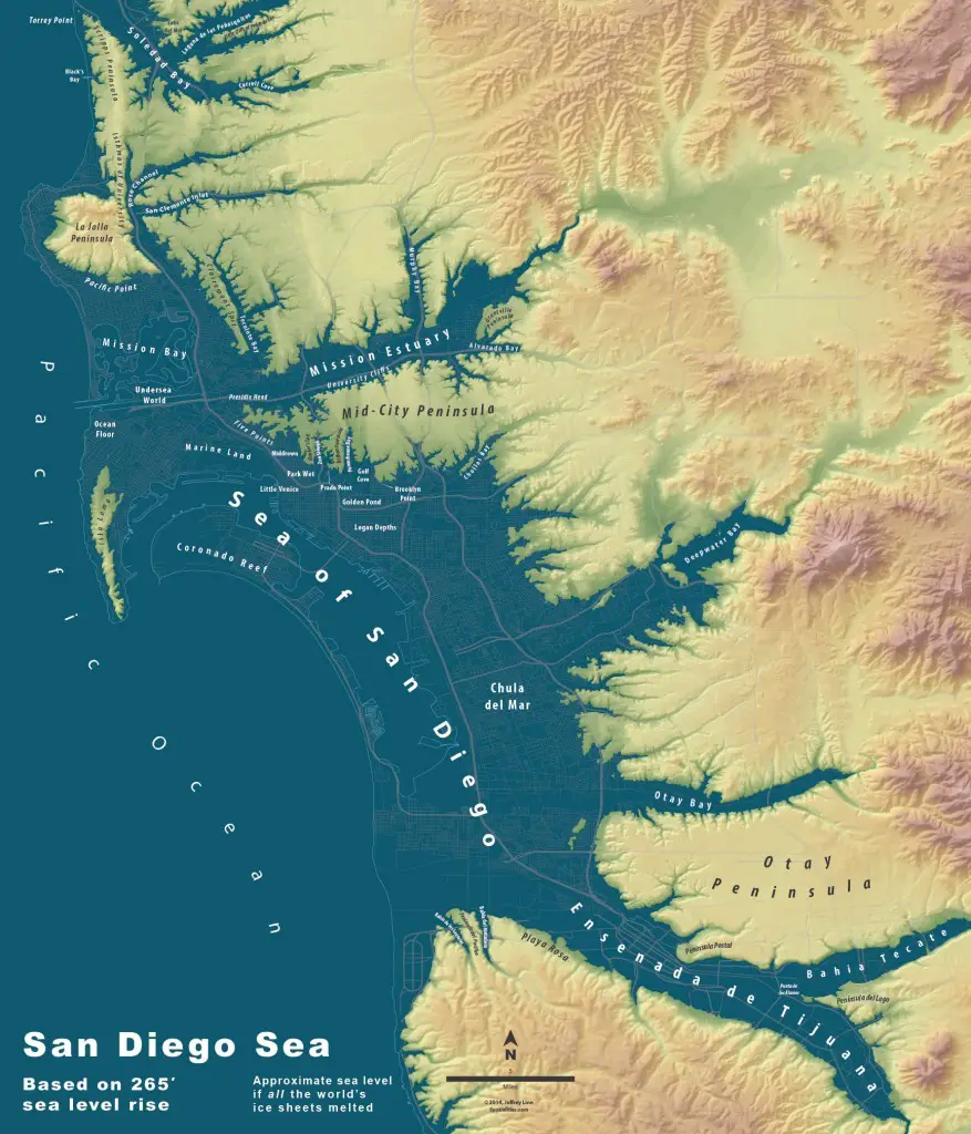
Extreme sea level rise maps of San Diego Sea based on 265 sea level rise.
Related Story:
NASA First Ever Mapped Greenland’s Ice Sheet in 3D