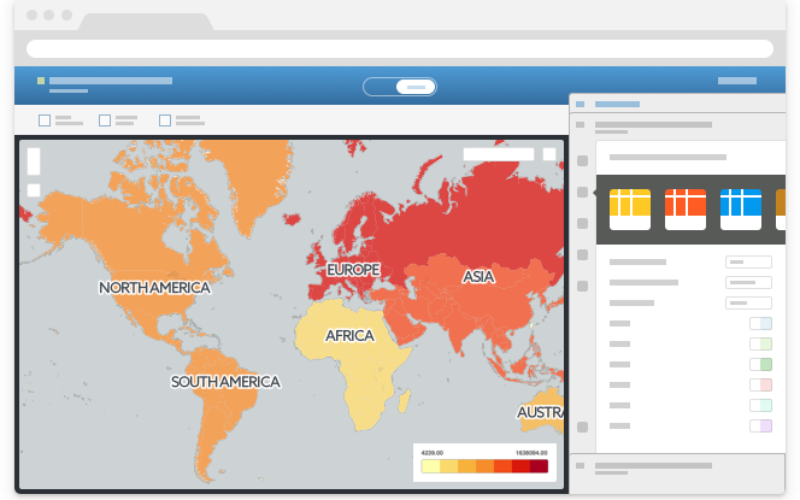
Our brand new functionality will analyze your uploaded datasets and make suggestions of columns to visualize, offering you a selection of ready-made maps from the moment you click over to the dashboard. The platform will now give you a variety of sample maps to choose from, tailored to fit your visualization needs.
Remember the days before cell phones, when you used to have to wait around at home to take a call? Or when the only way you could buy books, groceries, and clothes was by physically going to a store? Or when you had to select the best way to visualize your data on a map by clicking through various options yourself? No more.
CartoDB One-Click Mapping has landed. CartoDB already let you jump from datasets to shareable, web-based data visualizations in a matter of seconds. With One-Click Mapping, that jump is even shorter.
Our brand new functionality will analyze your uploaded datasets and make suggestions of columns to visualize, offering you a selection of ready-made maps from the moment you click over to the dashboard. The platform will now give you a variety of sample maps to choose from, tailored to fit your visualization needs.
You’ll be able to scroll through the options to see which visualization will tell the best story about your data without having to do all the investigation yourself. And, of course, the map you choose will remain fully editable, allowing you to make all the fine tweaks your heart desires.
Building One-Click Mapping has been extremely fun for us because we have not seen anything like this before. Even more fun has been seeing it in action and looking at the time we save you by writing code to analyze your datasets!
One-Click Mapping helps with the initial design of your maps by identifying the columns in your datasets that are best suited for mapping, based on some basic rules of thumb for data visualization.
For example, datasets that contain a timestamp column weigh in favor of visualizing with spatio-temporal Torque maps. If we see that another column has very few nulls and several unique values, we’ll suggest a category map. And with just one click, you have access to these pre-styled maps!
For numerical data, our analysis looks at the shape of the histogram to identify the quantification method (which calculates the width of bins for a histogram) that should apply. If the data is highly clustered the algorithm will favor a choropleth map over a bubble map. For choropleths, if the data peaks in the center or on the edges, we apply a divergent color ramp like you see for election maps. Data that falls to the right, left, or is flat gets a sequential color ramp.
Want to use it? Just log into your account and create a new map! Once created, you will see the suggestions dialog in the lower left of your map.
We’re excited for you to try out this feature today; give it a go and let us know what you think of it! This is only our first implementation of the feature, so watch this space for announcements about smarter mapping. This is just the beginning!